Quantcast
Channel: gouache – Jackson's Art Blog
Viewing all 27 articles
Browse latest View live

Free tube when you order Winsor & Newton Designers Gouache

$
0
0

Great offer:
Free tube when you order Winsor & Newton Designers Gouache.

Request a free 14ml tube of white Winsor & Newton Gouache when you buy three 14ml tubes of Winsor & Newton Gouache. A maximum of three free tubes per customer please.

Winsor & Newton Designers Gouache

Offer ends on the 31st of March.

Click on the link above or the image to go to the offer on the Jackson’s website.

The post Free tube when you order Winsor & Newton Designers Gouache appeared first on Jackson's Art Blog.


Turner Acryl Gouache new sizes and sets

$
0
0

Turner professional quality acrylic gouache has a wide range of 219 colours in 20ml tubes.

The popularity of this paint is growing all the time and it is getting superb customer reviews. The only complaint has been that they wish it were available in larger sizes.

So we are very happy to announce that we now have larger sizes and new sets:

*38 colours are now available in 40ml
*White is now available in 100ml
*6 sets are available including a new 6-colour tryout set of small tubes for only £2.00 (limited to 1 per customer) and a new set of 45-colours in a range of colours called Japanesque.

Read much more about this great paint in this earlier post.

Turner Acrylic Gouache 6 Colour Intro Set

Turner Acrylic Gouache 6 Colour Intro Set (limited to 1 per customer)

The colours in the intro set are all lightfast.
The intro set is free post if that is all you are getting. So give it a try!

Click on the link at the top or the image to go to the gouache on the Jackson’s website.

The post Turner Acryl Gouache new sizes and sets appeared first on Jackson's Art Blog.

Turner Gouache on offer

$
0
0

For those of you who have recently tried the sample set and fell in love with these amazing paints – here’s a great opportunity to increase your range of colours with this fantastic offer.

11ml Turner Acrylic Gouache 6 Colours Sample Set

Turner Gouache single tubes are 10% off the already discounted price. Until September 11th 2012. Available in 20ml, 40ml, and 100ml tubes.

We had a huge surge of positive feedback on these paints when we introduced them last year, more than I have witnessed with any other product. It seems that if you try it, you love it! I found the rich opacity and lovely, velvety finish to be quite useful in some of my paintings.

Turner Acryl Gouache in 20ml, 40ml and 100ml tubes

Acrylic Gouache is Matt Acrylic paint and Turner Acryl Gouache is one of the highest quality ranges available today- with a gorgeous, rich velvety finish. A professional quality acrylic gouache with a wide range of 219 colours, they are ideal for illustrative painting and design work. They are made in Japan to the highest specifications.

Acrylic Gouache is Matt Acrylic paint and Turner Acryl Gouache is one of the highest quality ranges available today. A professional quality acrylic gouache with a wide range of 219 colours, making them ideal for illustrative painting and design work. Made in Japan to the highest specifications.

Read more about Turner Gouache in this earlier blog post.

The post Turner Gouache on offer appeared first on Jackson's Art Blog.

New Daler-Rowney Simply sets

$
0
0

New Daler-Rowney Simply sets – Daler’s value paint range.
Available in Oil, Acrylic, Watercolour and Gouache sets in a variety of sizes.

Simply Oils are affordable colours that can be used to paint on all conventional oil painting surfaces. These soft-bodied colours can be used straight from the tube as they wet easily onto the surface.

Daler Rowney Simply Oil Set

Simply Acrylics are affordable colours that can be used to paint on all conventional art surfaces such as paper, cardboard, canvases, etc. These soft-bodied colours can be used straight from the tube as they wet easily on to the surfaces, or they can be thinned with water. Value acrylic colours.

Daler Rowney Simply Acrylic Set

Simply Watercolours are affordable, basic colours that can be used to paint on all conventional watercolour surfaces.

Daler Rowney Simply Watercolour set

Simply Gouache is an affordable range of colours which can be used to paint on all conventional watercolour surfaces. All colours in the range have been formulated to give opaque colours with strong covering power.

Daler Rowney Simply Gouache Set

The post New Daler-Rowney Simply sets appeared first on Jackson's Art Blog.

Lascaux Acrylic Gouache introduce three new colours

$
0
0

Lascaux Acrylic Gouache have added three colours to the range:
Process Citron (Yellow), Process Magenta and Process Blue.
Available in both sizes: 85ml and 250ml.

Lascaux process colours

Acrylic gouache is not normal gouache. It can be worked on top of without smearing. It is an opaque, matte finish, water-soluble, fluid acrylic that is usually water resistant (not waterproof) when dry. Being opaque and drying to a matte finish is like traditional gouache, being water resistant when dry and adhering well to many surfaces is like acrylic. It uses an acrylic polymer binder. Lascaux is a variation: it is not as water resistant when dry but can be painted over without smearing.

BLG

Click on the underlined link or image to go to the paints on the Jackson’s Art website.

The post Lascaux Acrylic Gouache introduce three new colours appeared first on Jackson's Art Blog.

AV Vallejo Acrylic Gouache

$
0
0

AV Vallejo Acrylic Gouache is a gorgeous matte paint in a creamy format, that adheres to most surfaces. It has been made with the best raw materials and a very high content of pigments in an acrylic co-polymer emulsion. The formula of these quality colours has been developed to create maximum opacity, purity and permanence.

All AV Vallejo Acrylic Gouache colours are completely lightfast, and dry quickly to a matte and waterproof finish; they can be overpainted within minutes. Acrylic Gouache has a smooth and creamy consistency. Due to their thixotropic formulation, the colours become more liquid when stirred or shaken and apply very easily, drying to an even, flat surface without showing traces of brushstrokes. They can be used on all surfaces, including metals and plastics.

acrylic-gouache

The colours can be mixed with one another, with acrylic mediums or they can be diluted with water to obtain watercolour effects.

Acrylic Gouache is used in fine arts, whenever a totally flat, opaque surface is required, and as a poster paint in graphic arts, design and illustration. The colours have an ideal consistency for use with stencils and silk-screens. Painting tools are cleaned with water or alcohol if the paint has dried.

Click on the underlined link at the top of this post or the image to go to the paint on the Jackson’s Art website.

AV Vallejo Acrylic Gouache colour chart

The post AV Vallejo Acrylic Gouache appeared first on Jackson's Art Blog.

Schmincke bronzing powders

$
0
0

Ooh, shiny!

New from Schmincke
Brilliant bronzing powders – one mixes with water and one with solvent medium – to create metallic paints. Great for adding gilded effects to your painting and other artwork. Available in three gold colours, copper and two silvers.

bronzes

TRO-COL Pigment Powders
Bronze-powder with watersoluble binder. Combine with water to make highly brilliant metal colours and you can mix it with watercolours and gouache. Available in 20ml jars.

Wet Bronze Powders
These bronze powders should be mixed with bronze medium (see link below) or with oil paint right before you use them to paint some shiny metallics onto your oil painting or other artwork! Available in 20ml and 100ml jars.

Roberson’s Ormoline Bronzing Medium

Click on the underlined links or the images to go to the bronze powders on the Jackson’s Art Supplies website.
As always- standard UK shipping is free with orders of £39 or more and just £3.95 for orders under £39.

The post Schmincke bronzing powders appeared first on Jackson's Art Blog.

Jacksons Sable Spotter Brushes on offer

$
0
0

For a limited time now on offer at Jackson’s

The Jackson’s series 913 is a short-haired, large-bodied brush made with pure Red Sable hair with a polished walnut handle. It is designed to hold a large amount of colour and still give the finest of points on a small brush. Useful for detailed painting in all media it is especially well suited to the fine spots of colour and layering usually used in painting with egg tempera.


Jacksons Sable Spotter Brushes on offer
10% off until May 4th, 2014

Click on the offer link to go to the sable spotter brushes on the Jackson’s Art website.
Postage on orders shipped standard to mainland UK addresses is free for orders of £39.

The post Jacksons Sable Spotter Brushes on offer appeared first on Jackson's Art Blog.


Create wonderful art using only three colours

$
0
0

Learn the limited palette painting method from an expert!

Three Color Painting: Create wonderful art using only three colours

A 128-page paperback book by Stan Kaminski.

A good introduction to the use of gouache (opaque watercolour paint) and the information on how to obtain a huge range of colours from a very limited palette can be translated to any painting medium.

Three Color Painting: Create wonderful art using only three colours a Book by Stan Kaminski - Gouache

In this user-friendly and truly liberating book Stan shows how numerous shades can be achieved and stunning paintings created using just three paint colours – alizarin crimson, ultramarine blue and yellow ochre – plus white. Stan takes the reader through 20 demonstration paintings and explains not just how to paint, but the thought process involved in doing so. The demonstrations are divided into two sections: those using watered-down gouache, to create watercolour-style paintings and those using thick gouache, in the style of oil paintings. Using his techniques, he says, even a complete beginner will get a great result at the first attempt and the experienced artist will improve his painting.


Stan Kaminski

Warwickshire artist Stan Kaminski has been a professional artist for 38 years, working in design studios, advertising and now as a fine artist and teacher. He has vast experience, has won many prizes and has achieved excellent prices for his paintings at auction. One of his paintings was accepted into David Shepherds Wildlife Exhibition at the Mall Galleries in London.

Stan is a respected and much sought after tutor of painting, providing lessons from his well appointed studio near Kenilworth in the heart of the English Midlands. He is the originator of the ground breaking 3 colour painting method that enables even beginners to achieve outstanding results through a clear understanding of how to observe and interpret the subject rather than simply blindly copying. Restricting the palette brings cohesion and insight into hue and tonal value. Mixing all colours from the three essentials of yellow ochre, red and blue educates the eye far better than rather relying upon overly complicated and expensive arrays of ready made colour.


The image at the top is from the book- a painting by Stan Kaminski “The Ladies View Killarney”.


Click on the underlined link to go to the current offer on the book Three Color Painting: Create wonderful art using only three colours on the Jackson’s Art Supplies website.
Postage on orders shipped standard to mainland UK addresses is free for orders of £39 or more.

The post Create wonderful art using only three colours appeared first on Jackson's Art Blog.

ShinHan Pass Hybrid Colours

$
0
0

We have a new range of paints at Jackson’s!

ShinHan Pass Hybrid Colours

Shin Han Pass takes its name from a subway or metro pass. Like a travel pass that allows access to unlimited modes of transportation, ShinHan Pass allows both transparent and opaque techniques to be realised from a single tube. The low amount of gum arabic and glycerin in this paint makes brush strokes more free and colours appear more saturated. The artist quality colours are lightfast.

ShinHan Pass Design Hybrid Colours are so highly pigmented that you need to get used to using a smaller amount of paint. The strength shocked some of our testers who had trouble using less than they normally would and found it difficult to adjust.

ShinHan Pass is designed to be used thickly as a gouache or diluted with a lot of water as a watercolour. Because it can be diluted so much and still be colourful this paint goes a long way. It comes out of the tube creamy and ready to use as gouache, thick and opaque but smooth and spreadable, even with a dry brush. Picking up just a bit of colour with a wet brush adds a small amount of water and so gives you a thin gouache or a thick watercolour, that flows very smoothly. Further dilution gives you watercolour, by using a very wet brush with a speck of colour you will have a transparent and lighter colour.

My speculation is that ShinHan Pass has achieved a paint that can be opaque when thick and truly transparent when watered down because they have not added chalk to create the opacity but rather have just added a huge amount of pigment to the paint. This would also explain why it is so strong.

ShinHan Pass is available in 48 highly pigmented colours, than can be diluted down with lots of water to lighter colours.

ShinHan Pass is available in 48 highly pigmented colours, than can be diluted down with lots of water to lighter colours.


To get to know the paints and to see if they do what they claim I tried the paints in some sketches. I also wanted to see what they are like compared to the same make, ShinHan but in their watercolour and to see how they compare to other makes of gouache and watercolour so I did some comparison tests. I found that both Pass and the gouache are very opaque when painted thickly, but the two makes of watercolours come close. The Pass made a nice transparent light colour better than the gouache brand. The lifting of colour was similar in all of them. See full results later in the article.

I love the texture of the paint, especially in the middle dilution zone, using lots of water and a medium amount of paint. It flows beautifully and a brush load seems to last forever. I like the plastic tubes that don’t crush as you squeeze them or have that pressure inside that causes metal tubes to ‘over-squirt’, where you try to get the paint back in the tube but it ends up all inside the cap. The only drawback I found is a staining that occurs if you use it thick like gouache and then wet it to draw it out like watercolour – the original line might remain. One other thing to consider is that the colour range is good at 48 colours but is not huge so you will need to use your colour mixing skills. The low amount of binder means it is not particularly suited for glazing as the first layers will be disturbed by the next layer, though this is less pronounced when the first layers are thin.

ShinHan Pass glazing Permanent Yellow over Cerulean Blue.  The blue dragged off into the yellow on the ticker paint but less so on the wash.

ShinHan Pass glazing Permanent Yellow over Cerulean Blue. The blue dragged off into the yellow when the yellow was painted over the thicker paint but not as much when it was painted over the thin blue wash.


Making this unfinished painting of nasturtium leaves in the garden at The Maker’s Yard in Walthamstow was the first time I tried the ShinHan Pass paints. I didn’t know what to expect and found I thoroughly enjoyed painting, there was no frustration and no difficulties. The paint was transparent when it was watery and the opacity of it when it was thick let me paint on top of parts I wanted to add more colour to. It just seemed natural to use it this way. I added and subtracted and thinned without worrying about what I was doing and it all went smoothly. My only problem was that I had to stop painting to talk to some people and was never able to return to that painting.

Unfinished painting of nasturtium leaves using ShinHan Pass by Julie Caves

Unfinished painting of nasturtium leaves using ShinHan Pass
by Julie Caves


I did a quick sketch yesterday – I grabbed an apple from the table and did a sketch with the ShinHan Pass. The shadow in this sketch is a good example of how it works well as watercolour.

Apple sketch using ShinHan Pass paint by Julie Caves

Apple sketch using ShinHan Pass paint
The shadow in this sketch shows how it works as watercolour.
by Julie Caves


Comparison Charts

I wanted to know how the ShinHan Pass compared to the ShinHan Watercolour. I also wanted to know how it compared to another Gouache, I chose Winsor & Newton because then I could also compare the Winsor & Newton Gouache to the Winsor & Newton Watercolour, so I could compare the two comparisons.

I had 6 colours from the ShinHan Pass range: Burnt Umber, Sap Green, Cerulean Blue Hue, Permanent Yellow, Permanent Red and Permanent Violet. So I chose the same or nearest colours in ShinHan Watercolour, Winsor & Newton Gouache and Winsor & Newton Professional Watercolour.

I made up charts on Not-texture watercolour paper with a black marker line to help see opacity. I painted patches of colour to see:

  • what it looked like brushed right from the tube
  • what it looked like thinned with a lot of water
  • a wash where I wet the paper and then brushed paint at the top and tilted the paper to let it run.
  • how well colour lifts. I dabbed a folded paper towel edge in the centre of a medium thick painted patch.

Please note that yellows are hard to photograph and are not accurate in saturation.

ShinHan Pass chart to see the four characteristics.

ShinHan Pass chart to see the four characteristics.


ShinHan Watercolour chart to see the four characteristics.

ShinHan Watercolour chart to see the four characteristics.


Winsor Gouache chart to see the four characteristics.

Winsor Gouache chart to see the four characteristics.


Winsor Professional Watercolour chart to see the four characteristics.

Winsor Professional Watercolour chart to see the four characteristics.


You can see that both gouaches are very opaque when painted thickly, but the watercolours come close.
It was hard to get a nice transparent light colour in the Winsor Gouache but the Pass hybrid did it well.
I’m not sure that the tilted wash tells us very much.
The lifting was similar in all of them, perhaps the least in the Winsor Gouache. The Pass Cerulean Blue Hue appears to be staining and it was the least lift-able colour in the Pass set.


Comparison of Paint Extension

I compared the same four paints to see how far the colour would extend. I put a small bit of paint on the paper and brushed it out with a dry brush, then another with a small amount of water and a third with a great deal of water.

You can see that a small amount of the ShinHan Pass paint extends out to a great wash.

Comparing the same amount of paint in 4 ranges. Left to right: brushed with no water, brushed with enough water added to get a medium tone, brushed with enough water added to get a light tone.

Comparing the same amount of Cerulean Blue paint in 4 ranges.
Left to right: brushed with no water, brushed with enough water added to get a medium tone, brushed with enough water added to get a light tone.


Other Artists’ Reviews

We sent a set of 6 colours to some artists to get their take on the new paints.

Cath O’Leary

As a mixed media artist my base material is acrylic paint. I like its immediacy, texture and versatility. My favourite work is done in response to land and sea when I can get out of Bristol. The capturing of a moment. I love to experiment with materials and on occasion use watercolours and some old gouache that sits in a drawer most of the time, so waited with excitement for my ShinHan Pass paint to arrive.

Possibly because I don’t use watercolours on a regular basis, and being a kind of impatient get it down quick painter, I was surprised by the selection of colours: permanent red, permanent yellow, violet, burnt umber, cerulean and sap green. I found myself slowly mixing small squares of colour, a couple of new colours a day, and remembering old colour mixing knowledge, looking at the different transparencies and colours from vibrant to subtle. The colour selection made sense and produced rich and varied mixes. As a watercolour paint, ShinHan Pass dilutes well, the tinting strength is good and it seems very economical. As a gouache, the colours have complete opacity when undiluted, giving marks and brush strokes while also strong enough to use with printing blocks. Applied very thickly, as I would acrylic, it cracks on drying. This can be useful at times and not at others, but the pigments are strong enough to mix well with acrylic mediums – I mixed it with both iridescent and fine grain medium to good effect. The paint has a creamy consistency and works well on card and canvas as well as on watercolour paper. I also tried using it on a base of white emulsion, as well as plaster, meaning that I could scrape back into the paint and use the watercolour properties to layer the colours and the gouache properties for stronger colour.

I will definitely continue to use ShinHan Pass paint, certainly I am very happy with the colour intensity and its versatility and will particularly use it when travelling by train with a need to keep things minimal – with some acrylic medium and a few extras…I like to mix my materials. I will also use it on days when I need to operate at a slower pace which personally I will find very useful and a new way of working.
I’m hooked!

Cath O'Leary testing ShinHan Pass Hybrid colours

Cath O’Leary testing ShinHan Pass Hybrid colours

Cath O'Leary testing ShinHan Pass Hybrid colours

Cath O’Leary testing ShinHan Pass Hybrid colours

Cath O'Leary testing ShinHan Pass Hybrid colours

Cath O’Leary testing ShinHan Pass Hybrid colours


Kath Woollen
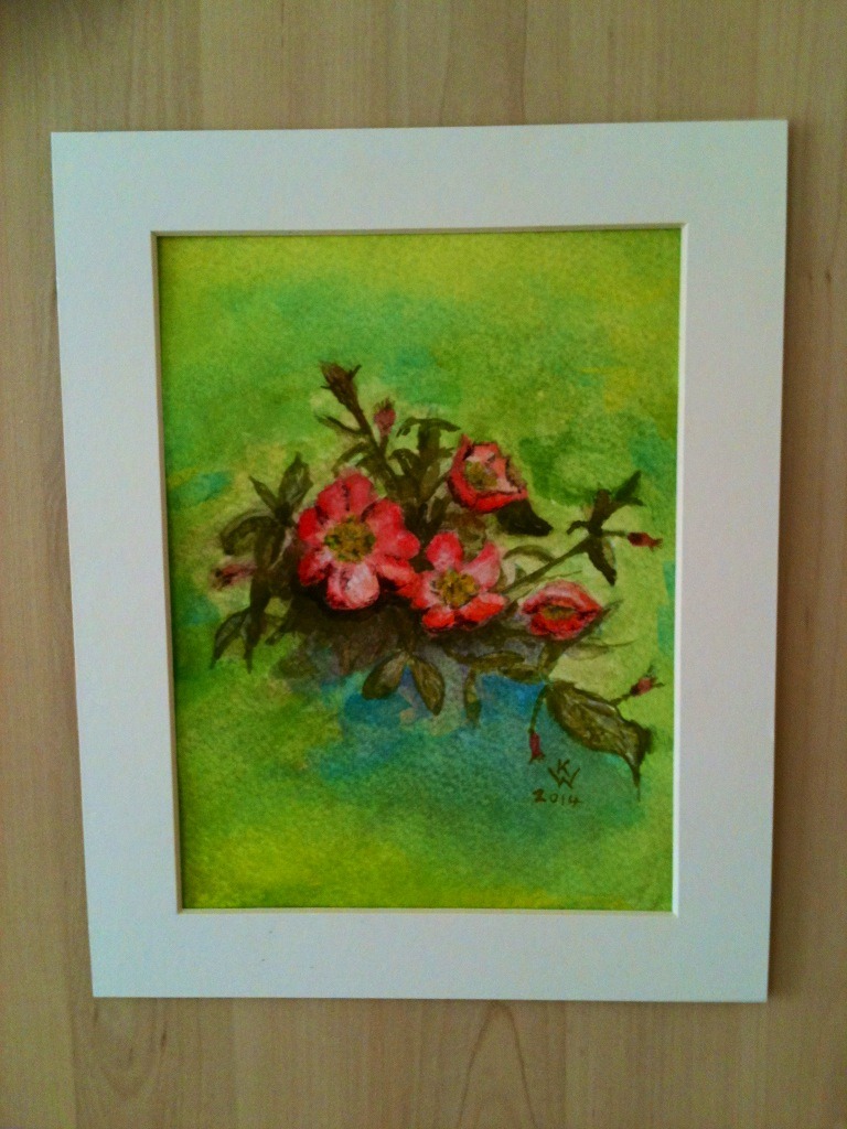
As a watercolour they are very different to the paints I am used to, Winsor & Newton. I found that the colours/pigments were very much stronger than ‘normal’ watercolour and the transparency not as good. The pigments of the ShinHan Pass tended to ‘stain’ the paper and were very difficult to work with in the usual way I work with watercolour.

In my opinion, ShinHan Pass paints are much better as a gouache than a watercolour.
The flower painting I provided an image of frustrated me! I just couldn’t get the lightness and delicacy of colour of the flowers that would have been easy with normal watercolour.

The consistency of ShinHan Pass paint is similar to watercolour out of the tube, perhaps a bit more loose and liquid than Winsor & Newton, therefore tends to come out of the tube in a bit of spurt. But it is smooth and spreads well.

Overall I have to say I did not particularly like ShinHan Pass for the kind of paintings that I like to paint – it doesn’t suit my style or my preferred subjects. However, other artists who like to work with very strong and bright colours will probably like it much more than I do.

Kath Woolen testing ShinHan Pass Hybrid colours

Kath Woolen testing ShinHan Pass Hybrid colours

Kath Woolen testing ShinHan Pass Hybrid colours

Kath Woolen testing ShinHan Pass Hybrid colours

Kath Woolen testing ShinHan Pass Hybrid colours

Kath Woolen testing ShinHan Pass Hybrid colours


Lane Mathias

When I received these paints to review I was intrigued. A hybrid paint? A paint that can perform as watercolour, gouache, even acrylic? How can this be so? I was also a little apprehensive as I’m certainly no watercolour artist. I paint in heavy body acrylic and rely on a butter consistency to create texture. Watercolours and gouaches are only kept in the travel easel for outdoor sketching so I was well outside any painterly comfort zone.

The consistency of the paint is slightly viscous and very gouache like. I first attempted a few wash sketches to see how it would perform as a watercolour. A little paint goes a long way but once diluted, transparent washes build up very cleanly. I tested with a set of six colours and each one was intense and true. Mixing colours was slightly tricky and again, you have to remember to dilute very well to stay in watercolour mode.

As a gouache, the paints worked very well as they are highly opaque when undiluted. In fact they’re so opaque that it’s easy to slip into the acrylic zone without realizing it, so a little dilution was necessary to keep a ‘flat’ surface. I was impressed with the texture, surprising in a paint so fluid.

These paints are a very useful hybrid – a great, multifaceted addition to any tool kit and definitely useful for ‘en plein air’ painting as you can adapt them as the mood takes you. (Remember to take a lot of water not just for dilution but the high pigment content means extra brush washing)! I also think the versatility of these paints would perform very well for mixed media artists as they would work well in their various dilutions with collage.

Perhaps not a replacement for the paints we all know and love, but definitely one to keep nearby for when you need a very accomplished jack of all trades.

Lane Mathias testing ShinHan Pass Hybrid colours

Lane Mathias testing ShinHan Pass Hybrid colours

Lane Mathias testing ShinHan Pass Hybrid colours

Lane Mathias testing ShinHan Pass Hybrid colours


Violeta Damjanovic

Violeta Damjanovic testing ShinHan Pass Hybrid colours

Violeta Damjanovic testing ShinHan Pass Hybrid colours

Violeta Damjanovic testing ShinHan Pass Hybrid colours

Violeta Damjanovic testing ShinHan Pass Hybrid colours

Violeta Damjanovic testing ShinHan Pass Hybrid colours

Violeta Damjanovic testing ShinHan Pass Hybrid colours


Suzy Fasht

– This paint works well as a watercolour – the paint is high quality and the pigment granulates as you would expect with high quality watercolour, the paint becoming extremely transparent and easy to spread when diluted with water. The only issue was in “lifting out” the paint – it was very strong and dyed the paper to such an extent it was harder than straight watercolour to “lift out”.

– This paint also works well as gouache – colours were beautifully vibrant and dried to a matt finish, I was able to paint light colours over previously darker areas.

– The paint works equally well diluted as a watercolour or with little water as a strong gouache. The only disadvantage was I couldn’t lift the paint out when I worked areas with a brush and blotted them – it was hard to get back to any white paper – just a slight fading happened. So when I wanted to soften dried edges it was more difficult than with a traditional watercolour.

– If you like using watercolour and gouache together in an artwork this paint is ideal because the same colour can be used throughout the painting in different strengths. The disadvantage is that once dry, it is more difficult to manipulate and soften sharp edges.

– I am very impressed with the quality of this paint and will definitely use it in the future – it flows beautifully and enables watery washes or strong matt flat areas with the same paint so it is extremely versatile. The colour is glowing and the artists quality pigment means a little goes a long way, there is no cheap filler, it looks very pure.

– The colours are intense and vibrant (see point 7) – the only drawback is the names on the tubes which do not explain which pigment is in them. However colour index pigment numbers are given so these can be looked up. For instance “Cerulean blue” turned out to behave more like a phthalo blue and “permanent red” was discovered to be a Naphthol red.

– The paint flows beautifully with a smooth consistency whether watered down or used quite like gouache – there is no glycerine type feel as with some high quality watercolors. It dries with a slightly matt look.

Suzy Fasht testing ShinHan Pass Hybrid colours

Suzy Fasht testing ShinHan Pass Hybrid colours

Suzy Fasht testing ShinHan Pass Hybrid colours

Suzy Fasht testing ShinHan Pass Hybrid colours

Suzy Fasht testing ShinHan Pass Hybrid colours

Suzy Fasht testing ShinHan Pass Hybrid colours


Click on the underlined link to go to the current offer on the ShinHan Pass Design Hybrid Colours  on the Jackson’s Art Supplies website.
Postage on orders shipped standard to mainland UK addresses is free for orders of £39 or more.

The post ShinHan Pass Hybrid Colours appeared first on Jackson's Art Blog.

Wendy Jacob on Painting with Gouache

$
0
0
Although Wendy Jacob’s gouache paintings of landscapes and still lifes rarely if ever feature the human form, the compositions are full of character. Still life objects such as bowls and jugs appear with a real presence, animation suggested as they rest at jaunty angles in stacks, and vibrant contrasted painted patterns converse with one another. Wendy Jacob is known to flatten and distort perspective in order to create the right mood for each composition, and has a sophisticated sense of colour that utilises soft colour harmonies. In the past Wendy has exhibited at the Royal Academy Summer Exhibition, The Sunday Times Watercolour Competition, the New English Art Club, the Discerning Eye and the Royal Watercolour Society. She currently has work in the ‘Off The Wall’ exhibition at the Bankside Gallery.

Lisa: What do you love about gouache?

Wendy: It is a forgiving medium. Gouache is opaque with vibrant colours and the paint, mixed with water to a creamy consistency, easily covers a layer beneath very effectively, allowing changes to be made to your painting as it progresses. It does not require the technical skills of watercolour and allows you to forget technique and concentrate on what the painting is about.

Wendy Jacob: 'Venice, Fish Market', gouache

Wendy Jacob: ‘Venice, Fish Market’, gouache

Lisa: What surface do you enjoy painting on the most?

Wendy: I paint on smooth watercolour paper which I stretch. This is done by soaking some paper of the size you need for the painting in water for a few moments and, after shaking the off the surplus, placing on to a wooden board (offcuts of plywood are useful for this) and sticking the edges of the paper down using gummed brown sticky tape. As the paper dries the paper contracts and you have a wonderfully smooth stable surface on which to work. I love the unyielding surface this produces.  But this is just my personal preference – and I know many excellent artists who never do this.

Lisa: How do you decide how you place objects for your still life compositions – what vital ingredients are you looking for?

Wendy: A good question – I take great care composing the objects for a painting.  It is important to gather a collection of objects you love with strong simple shapes that can be arranged in relation to each other. I avoid great differences of scale. Each season of the year has  paintable flowers, fruit and vegetables that regularly appear in still life paintings. I am waiting just now for my neighbour’s quinces to ripen.

I like to have the still life subject near to eye level and so arrange some sturdy wooden boxes on a small folding table placed so that light falls sideways from the window to help describe the form of the objects. I use a selection of coloured papers or fabrics to set off the objects. Having found a group of compatible objects I often make a small series of the same objects in slightly different arrangements before moving on to new subjects.

Wendy Jacob: 'Six Stacked Pots On A Shoebox', gouache

Wendy Jacob: ‘Six Stacked Pots On A Shoebox’, gouache

Lisa: Do you work away from or in front of the subject?

Wendy: Always in front of the subject for still life.  I make preparatory drawings before starting a still life painting. For landscape I keep my eyes open for suitable subjects and carry a sketchbook with me for drawing anything which looks promising. If a subject seems to be  possible I do a more intense drawing which makes me look really hard at the subject and help to work out the composition. I also carry a camera – but for only backing up the drawings.

Lisa: How do you feel being a member of the RWS helps with a painter’s career?

Wendy: As a very enthusiastic member of the RWS I have benefited from the opportunity to show work regularly in a well designed modern gallery which attracts many passing art lovers on their way to Tate Modern.  A great joy are the other RWS members who are generous, supportive and encourage you to keep working when your paintings may not be turning out as you had hoped.

Lisa: You are currently showing 3 chair paintings at the RWS ‘Off The Wall’ exhibition at the Bankside Gallery. Can you tell me why you were drawn to painting chairs?

Wendy: This was a case of keeping my eyes open. Earlier this year I was staying in a small village in France which has an outdoor cafe furnished with a selection of unmatched, ancient, shabby chairs.  They caught my attention and thinking about the Off the Wall exhibition coming up during July and August , I thought a few of these chairs might make a good subject. They are almost still life paintings.

Wendy Jacob: 'Stacking Chairs', gouache

Wendy Jacob: ‘Stacking Chairs’, gouache

Lisa: Did you particularly admire any of the other works in the show and if so, which and why?

Wendy: I love the mysterious paintings by Helga Chart and the small still life paintings by William Selby.  As always Annie Williams is showing some beautiful still life paintings.

Lisa: How often do you find time to paint during the working week?

Wendy: Painting is my default activity – unless I have something else that really must be done urgently, I head for the studio after breakfast and work until about six in the evening – admittedly with many a break for coffee.

Wendy Jacob: 'Beach', gouache

Wendy Jacob: ‘Beach’, gouache

Lisa: What are you working on at the moment?

Wendy: I am preparing for the next RWS exhibition ‘Watercolour Journeys’ opening at Bankside in October. Perhaps there will be some more chair paintings as I am holidaying in the ‘chair village’. 

Lisa: Where online or in the flesh can we view more of your work?

Wendy: At my website  – wendyjacob.com and of course in the RWS ‘Watercolour Journeys’ exhibition showing at Bankside Gallery from October 2nd to November 2nd. For another week I have a painting called “February Hedges, Hyde Hall” at Llewellyn Alexander Gallery, at 124 -126 The Cut, Waterloo, London SE1 8LN.

Wendy Jacob: 'February, Hedges, Hyde Hall', gouache

Wendy Jacob: ‘February, Hedges, Hyde Hall’, gouache

The post Wendy Jacob on Painting with Gouache appeared first on Jackson's Art Blog.

From Printmaking to Gouache to Oils, by Leah Davies

$
0
0
Leah Davies studied Printmaking for 5 years at art school before finding her way through experimentation and painting in gouache to her current standing as a highly reputable pet portraitist in oils. Leah shared her thoughts on how she navigated from printmaking to gouache to oils, and the reasons why each of these mediums have inspired her.

After leaving art school, and spending the previous five years studying printmaking, I experienced a moment of grieving – standing in my tiny apartment, I was broke and couldn’t afford to rent studio space to continue my practice as a printmaker. The easiest way to get over that was to pull out my cache of art supplies and make do with what materials and space I had.

Leah Davies: 'Butterfly', gouache

Leah Davies: ‘Butterfly’, gouache

Gravitating towards a cheap children’s pack of gouache paints, I began filling a sketchbook, not equipped to handle water media, with what could only be described as doodles. Page after page I explored the medium, working in washes, applying it as thick as I could. I saw what happened when I layered the paint, one colour on top of another. In time I knew this paint well, finding parallels between my printmaking methods and my new method of working in gouache.

Leah Davies:'Orchid 3', gouache

Leah Davies:’Orchid 3′, gouache

I quickly traded in my children’s pack of paints for M. Graham gouache paints, made here in U.S.A. They were creamy, and boasted vibrant, clean colors. I also moved outside of my sketchbook, discovering that a piece of smooth, acid-free mat board was a perfect rigid surface for working in a water media, avoiding the buckling of paper. In my practice, I began to understand the permanence of gouache – upon applying the paint to a surface, its staining properties made it difficult to recover from mistakes. I resolved this by preparing my mat board with several layers of Winsor & Newton Lifting Preparation. This translucent layer would allow for washes, and even thick layers of paint, including the staining colours, to easily lift off the paper by simply dipping a clean brush into water and “erasing” mistakes or to bring out highlights.

Leah Davies: 'Orchid 1', gouache

Leah Davies: ‘Orchid 1’, gouache

My next step was to combine my obsessions into one joyous experience: my fascination with the flow and intricacies of flower petals, the excruciating need to capture every detail I could see with my eye, and my new love of working in gouache. This produced a body of work consisting of over 20 gouache paintings of flowers, plant life, and insects. I loved layering the gouache – a thin layer in wash. Then lifting to find a highlight. Adding thick, opaque blocks on top of the washes. Painting loose, and then finishing with fine details. I was fortunate enough to have a solo art show exhibiting this body of work in 2006. However, by the close of the show, I didn’t want to look at one more flower. I switched my devotion to the one that deserved it most: my new French Bulldog, Henry. That painting launched me into my current career as an artist, almost ten years later, as a pet portrait artist.

Leah Davies: 'Señor Alec Thompson', oils

Leah Davies: ‘Señor Alec Thompson’, oils

As years went on, I explored M. Graham’s oil paint and fell in love with what the new medium had to offer. It was so different from gouache. Now I loved the permanence, painting one solid layer on top of another solid layer. In the beginning, I would switch between gouache and and oil depending on which medium and style my customers were attracted to. I soon came to realize that it was getting increasingly difficult to change my state of mind when switching from to the other. As I painted more and more in oil, I picked up my gouache less. There came a moment when I could no longer make the gouache work for me as it use to. My mind had completely switched to thinking in oil. Now, I paint exclusively in oil – a new challenge, a new obsession, a new love, a new method to conquer and make my own.

Leah Davies and Henry

Leah Davies and Henry

Leah Davies’ Website can be found at leahdaviesart.com

Facebook.com/LeahDaviesArt

Etsy.com/shop/LeahDaviesArt

Instagram: @LeahDaviesArt


To browse our printmaking section click here

To browse our gouache section click here

To browse our oil painting section click here


The post From Printmaking to Gouache to Oils, by Leah Davies appeared first on Jackson's Art Blog.

What is Acrylic Gouache?

$
0
0
With the popularity of our new Turner Acrylic Gouache paint, a lot of artists have been asking ‘What is Acrylic Gouache?’

Acrylic gouache is opaque, matte acrylic paint. The opacity means it has excellent coverage, the acrylic binder means it is waterproof when dry, so you can over paint without smearing and the matte finish gives a velvety surface. Like acrylic it also sticks to many surfaces with great adhesion.

turner gouache palette


Comparing acrylic gouache, traditional gouache and acrylic paint.

Comparing acrylic gouache, traditional gouache and acrylic paint.

Comparing acrylic paint, traditional gouache and acrylic gouache
  • Normal acrylics are quick-drying, water-mixable and vary in opacity depending on pigment (about half of the colours are transparent) and they usually have a satin finish.
  • Normal gouache is opaque, matte watercolour so like watercolour it is re-soluble, not water resistant.
  • Acrylic Gouache has characteristics of both of these. It is opaque and matte, quick-drying, water-mixable and water resistant once dry (so multiple layers can be over-painted with no bleeding or streaking). It also adheres well to many surfaces.

Acrylic-Gouache-comparison-chart

gouache-waterproof-comparison-before-and-after


Turner Acryl Gouache

Turner Acrylic Gouache is a professional quality acrylic gouache with a wide range of 219 colours, making them ideal for illustrative painting and design work. They are made in Japan to the highest specifications. The use of ultra-fine pigments means colours spread out smoothly so wide areas can be covered uniformly with a beautiful opaque matt finish. They are quick drying and water-mixable, yet water resistant once dry. Multiple layers can be over-painted with no bleeding or streaking, they also offer reliable adhesion to a wide variety of surfaces including metal, glass, plastic and wood.

turnerset

_Turner_Acrylic_Gouache_Atmos

The 219 Turner Acryl Gouache colours available:

Original Colours: A full range of basic and intermediate opaque colours, as well as three mixing colours. The mixing white, magenta and violet are made with lightfast pigments and translucent white for more precise colour mixing.

Pastel Colours: Designed to extend the original colour range, these unique light colours are perfect for creating clean, subtle tones in your work.

Greyish Colours: A range of elegant “greyish” pastel colours, perfect for subtle expression. Quiet tones that can be used without making your work too dark or murky.

Japanesque Colours: This selection of beautiful, sophisticated tones are formulated with fine powders which give them a unique slightly textured matt finish.

Metallic Colours: A series of metallic shades which are slightly more translucent than the regular colours, giving a sense of luminance and depth to your painting.

Pearl Colours: These effect colours have a refined pearlescent lustre. The last 6 pearl colours are “interference” tones which are translucent and will vary in appearance depending on ground colour and viewing angle.

Lamé Colours: This series of colours have sparkly metallic particles suspended in the paint. When painted over a black or dark ground, the colours will shine out. Application with a knife or spatula is recommended.

Lumi Colours: Brilliant fluorescent colours for bold effects, which will illuminate under ultra-violet “black light”. Don’t forget that because of the chemical reaction in all fluorescent colours they will become less bright over time.

Available in plastic tubes in sizes from 11ml to 100ml in singles and sets.


Read more

Read our other posts about Turner Acryl Gouache.


Artwork created using the Turner Acryl Colours
Iwasaki

by Iwasaki Eri using Turner Acryl Gouach in Japanesque colours


Shimoda

by Shimoda Masakatsu using Turner Acryl Gouache in luminous colours


Mishina

by Mishina Masako using Turner Acryl gouache in pearl, metallic and lame colours


Video showing use of Turner Acryl Gouache


Lightfast Permanence

The lightfast permanence varies – most of the 219 colours are very permanent or permanent. A few colours have fluorescent pigments and naturally they are fugitive – the lumi colours. But oddly there are about 10 other unexpectedly fugitive colours. Check the PDF of the colour chart on our website.


Other Makes of Acrylic Gouache

Jackson’s also stock AV Acrylic Gouache and Lascaux Acrylic Gouache , each with their own characteristics.

Click on the underlined link to go to the current offer on Turner Acrylic Gouache on the Jackson’s Art Supplies website.
Postage on orders shipped standard to mainland UK addresses is free for orders of £39 or more.

Turner Acryl Gouache

Turner Acryl Gouache

The post What is Acrylic Gouache? appeared first on Jackson's Art Blog.

Abstract Painting with Horadam Gouache

$
0
0

Gouache is a favourite paint of illustrators worldwide because it is opaque so it can be overpainted and corrected, yet it still has the simple and easy qualities of watercolour. Like watercolour it is bound with gum arabic which is re-soluble in water and because of the larger amounts of pigment used in artist-quality gouache it is opaque. Because of this you can also create transparent washes with some colours of artist gouache just by diluting it with more water.

Gouache colours are most often used for instructional purposes, illustrations and underpaintings – abstract works are rarely seen. We are therefore very pleased to look over the shoulder of the artist Anita Hörskens who uses Schmincke Horadam Gouache for abstract and mixed-media painting.


Abstract gouache painting with Horadam Gouache
by Anita Hörskens

Schmincke Horadam Gouache

Materials

The materials she uses:


Preparing the surface

Schmincke Horadam Gouache

As I like to work in series, I prepare three painting surfaces with Aqua fine modelling paste at the same time. To bring the surface to life, I glue a torn strip of newspaper with Aqua fine modelling paste on one of the vertical third lines. Here I keep in mind the rules of the golden section (2/3 to 1/3 proportion). I cover the desired area with a thin layer of modelling paste, arrange the newspaper in small folds and press it down with a painting spatula. I spread the remainder of the paste over the collage and over parts of the painting.


Drawing

Schmincke Horadam Gouache

I draw lines freely over the entire painting surface with a pencil. I have, for example, drawn my signature several times here. This results in engravings in the areas of the still moist paste.


Applying the paint colours

Schmincke Horadam Gouache

After the structure has completely dried, the first coat of colour is applied. What I like most about Horadam Gouache is the visual depth of the velvet-matt appearance of the dried colours. I also appreciate the natural, highly pigmented covering power. Since I do not intend that the series of paintings use the same colour families, I choose a different colour tone for each of the three paintings. I apply the colour simultaneously, but in different ways.


How I work – Painting ‘Blue Composition’

I painted Horadam Gouache in helio turquoise and cobalt blue light with the painting spatula over the entire painting ground.

Schmincke Horadam Gouache

I connected the two colours by filling the free areas with titanium white.
With the spray bottle I sprayed a fine mist of water over the entire ground so the colours started to run.
In the spontaneous colour flow of the pigments several more colour shades are created.

Schmincke Horadam Gouache

I used the painting spatula to place a large dark form in Vandyke brown in the middle of the painting.

Schmincke Horadam Gouache

With a stencil I again applied Aqua modelling paste. I interrupt the darkness and create additional effects.

Schmincke Horadam Gouache

I glazed a mixture of cadmium yellow light and olive green over the paste in the left half of the painting and agitated the brush with diluted paint residues so that they splash into the painting.

Schmincke Horadam Gouache

I brightened a mixture of helio turquoise and cobalt green deep with titanium white and proceed likewise on the right half of the painting.

Schmincke Horadam Gouache

I glazed a mixture of Helio turquoise and Quinacridone violet (thinned with water) from the upper right and lower left parts with a brush. I then sprayed onto the paint edges with a spray bottle.

Schmincke Horadam Gouache

In the last step, I took colour residues of titanium white and the mixed yellow-green on the spatula blade and spread it over the entire painting surface with the flat spatula as if I were ironing. Because the knife is held flat the colours only adhere to the raised structured areas, emphasising the texture.
The finished painting has a combination of intense, velvet-matt colours which are typical of the Horadam Gouache.


Other examples

These other works were painted in a similar technique but with different colour compositions.

Schmincke Horadam Gouache

Schmincke Horadam Gouache


About the artist

Anita Hörskens

Anita Hörskens

Anita Hörskens lives and works in Pfaffenhofen a.d.Ilm, Bavaria, Germany. She is an expert in most painting and drawing techniques. Originally a watercolour painter, she has been working mainly with acrylic and its possible combinations in the mixed media technique since 2002. More than 30 published instruction books, publications and videos are testimony to her expertise. Her German book “Acryl Praxis Buch” has been on the bestseller list as a classic standard work for years. The sought-after author is currently working on the implementation of a correspondingly well-founded “Watercolour Practice Book”. In addition, the artist has been working as a successful instructor for over 20 years, both in her own painting school and for various independent academies.


Schmincke Horadam Gouache at Jackson’s Art

Schmincke Horadam Gouache
Schmincke Horadam Gouache is artist-quality opaque watercolour available in 48 colours.

Schmincke Horadam Gouache on the jacksonsart.com website.

Postage on orders shipped standard to mainland UK addresses is free for orders of £39.

The post Abstract Painting with Horadam Gouache appeared first on Jackson's Art Blog.

Stephen Palmer: Negation as Creation

$
0
0

Stephen Palmer is an artist based in South London, UK, whose work A toast to never, pictured below, was shortlisted for the Jackson’s Open Painting Prize 2019. As seen in the work, Stephen’s paper models undergo a unique process of manipulation to achieve the desired outcome. The resulting works reflect an undoing of formal geometry, grid systems, and mark-making. In turn, they celebrate negation as a positive creative act. We caught up with Stephen to find out more about this process, the materials he uses, and how he develops his work.

Stephen Palmer - A toast to never

A toast to never, 2018
Stephen Palmer
Gouache on paper on board, 35.5 x 28 cm


Daniel: Tell us a little bit about your artistic background/education.

Stephen: I studied painting at Winchester School of Art in the late 80s and following that, after a spell in London, moved to Newcastle upon Tyne in 1998 where I took an MA in fine art at Northumbria University. My plan was to stay in Newcastle for a couple of years but it’s such a great place to live and work as an artist that I ended up staying for nearly 15 years.

There’s a brilliant artist-led scene in Newcastle with long-standing galleries like Vane and Globe, complemented by newer spaces that come and go. Plus there are some great printmaking resources such as Northern Print and Hole Editions, and bigger museum spaces like Baltic in nearby Gateshead.

Doing an MA really opened things up for me. I guess it’s easy to follow a particular path after your degree, informed by the teaching or ideology of the particular art school you attended. David Dye was head of the MA at Northumbria when I was there and his approach to teaching was very different from what I experienced at Winchester. So the MA is really where it all began for me in terms of the work I am making now. I’ve been back in London since 2012.

Stephen Palmer - Nothing means anything now

Nothing means anything now, 2019
Stephen Palmer
Gouache on paper on board, 35.5 x 28 cm


Daniel: How would you describe your practice?

Stephen: For the last 10 years or so I’ve primarily been making small paintings and drawings. Occasionally I also make editions, mainly screen prints. The recent paintings are all gouache on paper and the drawings are graphite pencil on paper, sometimes with a bit of coloured pencil.

I tend to work in series and will work exclusively on paintings for an extended period (sometimes several years) and then work exclusively on drawings, rather than working on both concurrently.

Stephen Palmer - Nothing left to lose

Nothing left to lose, 2019
Stephen Palmer
Gouache on paper, 29.7 x 21 cm


Daniel: Could you tell us more about your process when making your recent ‘paper’ works?

Stephen: The current paintings, and the series of drawings that immediately preceded them, result from a decision at the end of 2016 to really strip things back and simplify things. 2016 was a pretty rubbish year both in terms of the broader political and cultural context, and on a personal level. As a result I made the decision to ditch any obvious narrative references from the work and to start making things that could perhaps seem empty, but with the hope that that ‘emptiness’ would be pretty loaded.

In terms of the process, I start by making a ‘model’ from a sheet of A4 paper that has been defaced through a series of actions – folded, screwed up, ripped, cut up, scribbled on using blue or red biro or maybe embellished with geometric shapes (also in biro). The paper is then unfolded and flattened out in an effort to make it good, or re-assembled if it’s been cut into sections. Many of these models get discarded before one of them seems right to be the subject of a painting or drawing.

The paintings are created in gouache on another sheet of A4 paper, or most recently on paper mounted on board. I’m painting on black paper and the drawings are pencil on a white sheet of A4 paper. Although on one level these could be read as still life works, the model is depicted floating with no shadows, so it’s detached from any physical reality.

Stephen Palmer - Don’t know what I’m looking for

Don’t know what I’m looking for, 2018
Stephen Palmer
Gouache on paper, 29.7 x 21 cm


Daniel: What is it about gouache specifically that you find useful for making these works?

Stephen: I wanted to keep things as simple and everyday as possible in terms of materials. I like that A4 is really the most ubiquitous paper size, and working in pencil on paper seemed the most straight forward way of depicting these objects.

When it came to making the paintings I wanted to use a medium that wasn’t too ‘fine arty’. Whilst gouache is still a specialist medium, I like that it has connections more with design than fine art (in western art at least) and doesn’t have the same loaded history that oil paint has.

I tend to work with it in a fairly free way, adding areas in, stripping parts back, trying to keep things as fresh as possible. It’s probably not really designed to be used in this way and if I overwork it there’s always a danger that the surface of the paper starts to disintegrate, but I’m trying to live with this when it happens.

Studio Shot – Stephen Palmer


Daniel: Could you talk more about your interests regarding negation as a positive creative act?

Stephen: On a certain level I’d prefer a sheet of paper to be pristine and perfect. I guess I have a bit of a problem generally with objects that are chipped, broken or scratched. So ripping, scribbling on, screwing up and destroying the pristine beauty of an immaculate piece of A4 is counter-intuitive. Unfolding and flattening it is an attempt to make it good, to straighten it out, to fix it and put it back together (although it’s a futile attempt obviously as it will never look as it once did. I think of it like a piece of fine China that’s been mended really badly with UHU).

The models are made quickly and on one level making all these screwed up and scribbled on bits of paper might seem a fairly pointless thing to be doing. But in making them, I start making decisions about what works, about what looks and feels right. A certain scribble or doodle, a rip or a fold, may have a rightness that’s only apparent to me. Decisions are made very quickly. I like the idea that, even though I’m making this most simple and ridiculous thing, only I could make that object.

Stephen Palmer - Beyond all reach

Beyond all reach, 2018
Stephen Palmer
Gouache on paper, 29.7 x 21 cm

The painting process is the absolute antithesis of the process that goes into making the models. It’s very slow and labour intensive, academic even. Depicting a piece of A4 paper on another sheet of A4 could be seen as quite a formal thing to do but hopefully the nature of the original object is still there in the finished works, that intuitive ‘human’ quality of the models is still there.

To misquote Poly Styrene, there’s an element of ‘Oh formalism up yours!’ to it all.


Daniel: Can you tell us about the work you did with newspaper clippings?

Stephen: This is where screwing up pieces of paper really started for me. I’d worked on a series of drawings of newspaper clippings for several years, depicted very literally as flat pieces of paper cut from the original newspaper page.

The stories were all ‘non news’, mostly stories relating to past events that for some reason had resurfaced, and there were a few obituaries in the series. For me there’s a poignancy to newspaper obituaries in that often you only really learn about someone you may have never heard of before when you read their obituary.

It was a time when the printed press was looking more and more threatened by online news services so I started screwing up the cuttings partly as a nod to things becoming outmoded. There are a couple of cuttings taken from the final edition of The News of the World for instance, and a series of obituaries featuring pioneering developers who created the very technology that is leading to the demise of the medium they were being remembered in. These works were more like traditional still life paintings in that the object is depicted in a ‘real’ space (although it is a fairly minimal space).

Stephen Palmer - studio shot

He invented ebooks and made them freely available, 2016
(Studio Shot)
Stephen Palmer
Oil on canvas, 30 x 30 cm


Daniel: What are your most important artists’ tools, and do you have any favourites?

Stephen: Porcelain palettes. I have several including a couple I’ve had for probably twenty years or more. They are great for mixing gouache. I live in fear of dropping one and breaking it.

Studio Shot – Stephen Palmer


Daniel: What is a good day in the studio for you?

Stephen: Like many artists, my time in the studio is limited and has to fit around other responsibilities. So from that perspective, every day that I can be in the studio is a good one. It’s great to be doing this thing I really enjoy doing.

More specifically, finishing a piece of work always feels good, although of course it also means the whole process is about to start again.

Daniel: And when you’re working in the studio – do you listen to music, audiobooks, Radio 4, or do you prefer to work in silence?

Stephen: There’s always something on in the background. I tend to listen to 6music on weekday mornings, then switch to the World at One on Radio 4 at lunchtime (just as a reminder that things really are that bad). Afternoons, I might listen to some music from my phone, or maybe a podcast. There are a few really good art podcasts out there. One of my favourites is Michael Shaw’s The Conversation Art Podcast, it’s well worth a listen. During the football season there is something very comforting about listening to 5live on a Saturday afternoon – all is well with the world for a few hours at least!

Studio Shot – Stephen Palmer


Daniel: What are your artistic influences? Who are your favourite contemporary artists?

Stephen: One of the great things about living in London is having such easy access to so much contemporary art, so my favourite contemporary artists are generally those in shows I’ve seen most recently. I tend to post my favourites on Instagram, partly as a reminder to myself of what I’ve seen. A few recent favourites are Katrin Bremermann, whose work is included in the exhibition ‘Gradation’ at Patrick Heide Contemporary Art, and Erin O’Keefe who I’d been following on Instagram for a while but first saw her work in a group show ‘Joy before the object’ at Seventeen.

In terms of influences from art history, I look a lot at early renaissance paintings. I love the very detailed nature of the work made by northern renaissance painters like Jan van Eyck. But I guess the more geometric variants of modernism are probably my biggest influence. The László Moholy-Nagy show currently at Hauser and Wirth in London is excellent.

Stephen Palmer - Nothing to say

Nothing to say, 2017
Stephen Palmer
Graphite pencil on paper, 29.7 x 21 cm


Daniel: What is coming up next for you and where can we see more of your art in the flesh or online?

Stephen: Next up is a group exhibition curated by Marianne Walker in late September at Blyth Gallery, Imperial College, London. It’s titled ‘The Flesh of Thought’ and features a number of artists, including Marianne herself, who works with drawing in the broadest sense. Other artists in the show include Zoe Dorelli, Mary Griffiths, Mindy Lee, Robin Mason, Cat Roissitter, Anita Taylor, and Sarah Woodfine.

Recently I’ve entered a number of open exhibitions and competitions (including the Jackson’s Open Painting Prize) as a way to get my work seen more widely and been lucky to be selected for several of these including Creekside Open 2019 at APT Gallery in London earlier in the summer, and most recently Wells Art Contemporary 2019 Open.

You can visit my website here or for updates of both my own work and exhibitions I’ve seen you can folllow me on Instagram.

Stephen in his studio

The post Stephen Palmer: Negation as Creation appeared first on Jackson's Art Blog.


Emma Carlisle: Drawing as Salvation

$
0
0

Emma Carlisle is an artist and lecturer, based in Plymouth, UK. Her work is primarily concerned with the landscape she encounters in Devon and Cornwall, a subject that allows her to revel in colour and expressive marks in pencil, watercolour, gouache and acrylic. A burst of abstract, dynamic marks often becomes the land on which a small cottage or tree sits upon. A dedicated Instagrammer, Emma has garnered a substantial following thanks to her openness with regards her creative thoughts and processes. In this interview Megan Fatharly asked Emma about her approach to work, how she pushes herself and some of her favourite Jackson’s products.


Painted in a 21cm x 30cm Royal Talens Art Creation Sketchbook
Winsor and Newton Gouache, Caran d’Ache Luminance Pencils, Tombow Brush pens, Royal Talens Ecoline Pens
Inspired by a drive between St Just and Zennor in Cornwall
2019


Megan: why is drawing so important to you and your practice?

Emma: Drawing saved me during one of my toughest times.

At the start of 2018 I suffered from burnout after finishing one of my busiest work years, I was running an Etsy shop selling hand painted ceramics, lecturing part time at Plymouth University and trying desperately to write and illustrate more picture books (traveling backwards and forwards between Devon and London to meet with publishers and sell at craft fairs). This burnout coincided with some huge changes in my personal life which I wasn’t expecting and the two of them together took a big hit on my mental health. I know it might sound a bit dramatic but I basically fell apart.

Drawing has always been such a huge part of my life but for the first time in about 15+ years I didn’t want to create anything which felt so strange. I closed my studio door, focussed on my lecturing job and based my routine solely around teaching and going to the gym. In January 2018 I sold my kiln and my potters wheel, shut my Etsy shop and shortly after this left my literary agent. Again this all sounds really dramatic but I knew deep down none of it was making me happy.


About 5 months after I’d stopped creating I felt the urge to pick up a pencil again but by that time I felt out of practice and actually really scared to make anything. I thought back to the last time I was truly happy with my work and remembered the 6 week location drawing project which I’d done during my MA in Children’s Book Illustration at Anglia Ruskin. I decided to set myself a personal project of 6 weeks drawing on location which was probably one of the best decisions I’ve ever made. Not only did it get me back outside into nature (which is great for mental health) but it also eased me back into drawing and eventually at the end of June 2018 I felt happy enough to post what I was up to on my Instagram account, the support from everyone was really encouraging and so I started to share more and more pages from my sketchbook.

6 weeks turned into 6 months and I gave myself an extended deadline to the end of the year and after that I’d have to start doing some “proper” work. But when January came around I didn’t want to stop because I felt like I was onto something really exciting. I realised I was the one giving myself these deadlines, no one else, so I trusted my creative instinct, sacked off the deadlines and agreed to just carry on going indefinitely. Even though I’m still not sure where this work is going I know I’m on the right path because this is the most proud I’ve been of my work and other people seem to like what I’m up to too, which is always lovely to hear!

Drawing has been so important to me over the last year and a half, it kept me going and by posting the work I was making on Instagram it meant I could document my practice developing. If you scroll back through my feed you can see where I start to add colour, play with tone and introduce more materials. Looking back now I can see my confidence growing within my work and I know that is a direct correlation between how I felt within myself too, although it’s not been the easiest 18 months I feel like everything that has happened was meant to be; as my mum says – everything happens for a reason!


Megan: What’s your favourite Jackson’s product to draw ‘on the go’ with and why?

Emma: I couldn’t be without a Caran D’ache Luminance pencil, if I had to pick up just one specific colour to go out drawing with it would be the Paynes Grey 508. I try not to use black in my work as I think it can be quite restricting and often means I’m filling in blocks of tone rather than looking at the subtleties within it. The Paynes Grey Caran D’ache pencil gives you the option of creating some quite dark harsh lines but also can give you a lighter coverage if you use it with less pressure. If you wanted to add in a few other products you could combine it with a 553 Tombow Brush Pen and a Light Beige Neocolour II Crayon which will give you a lovely mix of tone and texture.


Drawn in a 13 x 21cm Royal Talens Art Creation Sketchbook
Royal Talens Ecoline pens, Caran d’Ache Luminance Pencils
Quick 30min location study at Strong Adolfos, Cornwall; Drawn very quickly because it was such a warm day my pencils melted!
2019


Megan: What other materials do you have your eyes on to have a play with?

Emma: I’ve just treated myself to 4 R&F pigment oil paint sticks after Emily Powell recommended them, I went for three bold bright colours and then one subtle cream colour, they’re amazing for adding extra texture to my bigger pieces but I’m too scared to take them out on location so I’d like to try some Sennelier soft pastels, I think I’ll find them a little bit less daunting and the colour range they have on Jackson’s website looks amazing! Plus a can of fixative so I don’t get them everywhere!


Drawn in a 13 x 21cm Royal Talens Art Creation Sketchbook
Tombow Brush pens, Caran d’Ache Luminance Pencils, Caran d’Ache Neocolour Crayons
1hr location study at Dartington Hall just outside Totnes, Devon
2019


Megan: Where’s your favourite place to go and draw?

Emma: That is a tough one! I’m forever inspired by Cornwall, I love going to St Agnes and also driving the coastal road between Sennen and St Ives. I’ve felt an instant connection with both of these spots and I always come home feeling a complete sense of magic and wonder. However I’ve not actually stopped to draw at either of them, just snapped some reference photos to use when I get back to my studio.

I recently went for a drawing trip to Salcombe with my friend Holly Wales and every bench just seemed to have the most beautiful view, I’d like to head back there because I feel like there was a lot more to draw! At the beginning of the summer I went drawing at Wembury on the wettest most miserable day and I loved every minute of that, there’s a small rocky island (which I’ve just googled and it’s called The Great Mewstone) about half a mile out to sea and I think on a normal sunny day I would have concentrated on drawing that but because it was obscured by the sea mist I was forced to concentrate on the way the sea met the shore and how the church seemed to loom in the grey-ness, it felt really spooky and mystical, very cool, I’d like to visit again on another grey day.


Drawn in a 13 x 21cm Royal Talens Art Creation Sketchbook
Royal Talens Ecoline pens, Caran d’Ache Luminance Pencils
Quick 15min study at Northcott Mouth (I was recommended to visit here by my favourite nearby restaurant – Temple in Bude)
2019


Megan: How do you keep your visual language fresh and energising? Your work is very experimental and free but anchored with illustrative elements…

Emma: I’ve always said that I learn more from the drawings that go wrong then the ones that go right. I’m not really like this in other areas of my life but with drawing I’m really happy to take a risk and just see what happens. I think because I’ve got this laid back attitude I seem to discover something new with every drawing/painting I work on. People keep telling me I look like I know what I’m doing but I’d like to break that illusion and say that I have no idea what I’m doing (I am a prime example of fake it till you make it – haha) but I don’t see that as a negative. I’ve said to a few people recently that as an illustrator I was always editing myself and chasing that “style” but as an artist I’ve had to flip that mentality and I’ve got lots of different ways of working now which I love, each one influences the other and I think that’s why my work has this freshness to it, I wouldn’t have it any other way.


Drawn in a 13 x 21cm Royal Talens Art Creation Sketchbook
Tombow Brush Pen, Caran d’Ache Luminance Pencils
Inspired by a drive home from Kent
2019


Megan: Who are some of the artists and processes you enjoy following on Instagram?

Emma: Oh gosh this is another tricky one there are so many!

Heather Day – I’ve loved her abstract paintings for years and always wished I could be more free like her. I feel like I’ve naturally progressed to a looser way of working (especially with my larger paintings) but I’m so glad that I didn’t just try and imitate her work or be directly inspired by just her. By going through the last 18 months of experimentation and process I feel like I’m able to have my own way of working, some people have commented on it having similar elements to Heather’s but I still feel like my work is very different from hers and very ‘me’ which is really important.

Helen Stephens – Helen came to speak when I studied on the MA in Cambridge and I felt so inspired by her lecture, I’ve since told her it really helped me start to value my sketchbook work and gave me more confidence when working on my picture book ideas. 6 years later and Helen is still inspiring me with her own location drawing posts as well as the #walktosee hashtag which she started for others to document their observational drawings. It’s one of the only hashtags I follow on Instagram because I love seeing what everyone is up to, constant inspiration!


Emily Powell – Emily is someone who I met through Instagram and then last month we met up IRL when I invited myself round to her home studio. I genuinely thought I’d already met Emily at Native Makers Christmas market but then quickly realised I hadn’t (haha – face palm emoji!) I was already SUCH a big fan of her work but now every time I see her I come away feeling so pumped and ready to paint! Her use of bold colour, looseness and material experimentation are things I could only dream of and since inviting myself over we’ve built a friendship based on our mutual appreciation of art supplies (we both love Jackson’s, tea and You’ve Got Mail – what more could you want?

Emma Farrons – Emma is currently on a maternity break from drawing but her location sketchbooks from earlier this year as SO inspiring and some of my favourites to see (she’s one of the few people where I regularly check her feed to see if she’s posted!) I love the way Emma captures the softness of movement and character in her figure drawings, her work has a 1950s charm but is still so modern and fresh, 100% one to follow!


Emma Carlisle


https://www.instagram.com/emmacarlisle_/

http://www.emmacarlisle.com/


Header image:

Drawn in a 13 x 21cm Royal Talens Art Creation Sketchbook on location in Polperro
2019

The post Emma Carlisle: Drawing as Salvation appeared first on Jackson's Art Blog.

Review of ShinHan Professional Designers Gouache

$
0
0

Gouache is a versatile, quick drying, water-medium paint, originally created to dry to an opaque finish and provide matte, flat, highly pigmented colour straight out the tube. It can be easily diluted to function like a watercolour paint but gouache has its own specific advantages: the ratio of pigment to binder is usually much higher than it is in watercolour, providing much stronger colour pay off for relatively little product used, and usually also contains chalk to increase its opaque finish. This opacity is similar to acrylic paint, however they dry down differently. Acrylic will leave a sheen depending how much water it is mixed with (the more water the less sheen), whereas gouache will always dry matte regardless of water quantity. Perhaps the only functional drawback of the medium is that when wetted the tone of the paint can appear different once it fully dries down. This can be easily combated since it’s quick drying time allows for layering, and the paint itself can be reactivated with water after drying.

Established in Korea in 1967 the ShinHan brand carries the slogan “Passionate Colour, Professional Touch” and after testing out the Professional Designers Gouache, I can confidently ensure that this product exemplifies their slogan. The colours I selected from their range to test – Carmine, Scarlet Red, Permanent Yellow Orange, Permanent Yellow, Permanent Green Light, Viridian, Turquoise Blue, Ultramarine Light, Violet, Burnt Sienna, Ivory Black and Permanent White – provided a flexible and vibrant palette although only a small sample of the 72 tube range. I tried a variety of application methods to test the full scope of the paints, which I’ll describe here in greater detail.


Pigmentation and Finish

To start, I swatched all of the selected colours with water (listed with their shade names on the left), and opaque from the tube (the column on the right). Overall this is a very warm palette, where both of the blues are even warm toned. This isn’t inherently a problem since all of these colours can be mixed to have cooler tones, but the fresh out the tube palette I chose may have benefitted from the addition of a couple of cooler options such as a Raw Umber or Prussian Blue for the sake of variety. All of the colours dried vibrantly and completely opaque with one coat, which is a testament to the quality of pigment ShinHan gouache contains.


Layering and Mixing

The inclusion of an Ivory Black and Permanent White in my palette allowed for tints and shades to be created with ease. On my second test sheet I experimented with these mixed with my two favourite colours in the batch; Violet and Ultramarine Light. Due to it’s quick dry time gouache can be easily layered to various effects, and here you can see I tested Violet with Ultramarine washed on top, Violet and Ultramarine mixed, and Ultramarine with Violet layered on top. Each strip has a different finish despite only using two tubes, showing how a variety of applications can make all the difference with this medium. I then tested a scale of tints using the Permanent White with both colours and a smaller scale of shades with the Ivory Black. These experiments all mixed beautifully with little effort to combine the pigment. Finally, for this sheet I decided to test a wash of the white and black over the already dried colour, which gave a more dynamic effect than the pre-mixed tints and shades.

An observation I made at this stage at this stage was how quickly my water became dirty. Due to the high pigmentation of a small amount of paint, every wash will dirty your water rapidly. If you’re looking to achieve very clean or light colours you’ll probably end up changing your water often. I would recommend working with two jars of water with this gouache to ease this issue – one being dirty for rinsing off colour, and a cleaner one for adding water to the paint.


Gouache with Mixed Media

Another benefit of gouache is that it can be used easily alongside other media, such as watercolour, acrylic, ink, pen, coloured pencil and graphite to name a few. I made a sample here of some of these combinations to show how they hold up on top of the ShinHan gouache. My favourite of the batch was the coloured pencils, since the chalky consistency of the gouache underneath gave it a finish similar to oil pastel.


Studies for Gouache Painting Techniques

Next I painted a couple of studies using the wider palette and a variety of brushstrokes and layering of colours. Gouache can sometimes be pigeon-holed as a designer’s medium, when in practice it has a much wider variety of function as we can see in these quick examples.


For the first study (on the left), I painted the hand in layers of light washes. This can have a subtle, luminous finish if the paper is allowed to shine through. I then blocked in the background colour and layered the red pattern on top. The pigmentation allowed me to decide how much blue I wanted to show through the red with one coat depending how much water I used. This control is satisfying to work with, and is evidence of the quality of pigment ShinHan gouache contains. Next I experimented with a wash of colour over the dried hand to make a shadow. Unlike using acrylic where a wash would not reactivate the paint below, I found that the gouache shifted immediately on contact with the water. With a light touch this movement is minimal, but if you wanted to fully preserve the work below I wouldn’t recommend this technique with gouache. Lastly I added some hatching to the hand using a thin brush, and enjoyed the effect of the drawn line against the wash below.

For the second study (on the right) I wanted to test blocking in the colour opaque. I tried to emphasise the brushstrokes to see how visible they’d be once dry, and they held up nicely. For the sheet underneath this hand, I allowed the colour to naturally bleed into a wash of water. I especially like how this turned out in the top left corner where it dispersed glowingly. Finally, on the top right of this painting I tested wiping away the paint once it dried down with a clean brush with water on it. This is how I created the lighter sphere above the fingers, and think this is a lovely technique for creating subtle highlights, although it would be difficult to wipe it past this tone without damaging the surface of the paper. Hopefully these simple studies convey a few techniques the ShinHan gouache can be used with.


Aside from the quality of the paint itself, the box sets of the ShinHan Professional Designers Gouache are clean and functional, although not as portable as pans of gouache. The inside of the lids are printed with the full list of shades available in the range (a massive 72), which is a helpful addition if you’re already familiar with artist’s colours to see which ones you could supplement this base collection with. If not, this list isn’t so helpful, and would maybe have benefitted from colour swatches printed in a leaflet. Without a box set, the individual tubes are easy to choose from on the Jackson’s shop as they’re photographed with a sample shade for ease of selection.

In terms of value per tube each contains 15 ml of paint which is on the relatively smaller side compared to the fluid volume in other available brands. However, this does make the paints small enough to throw in a pencil case, and the colour pay off is so rich, greater quantities aren’t absolutely necessary. Saying that, if you’re embarking on a large-scale project, this may not be the set for you when there are larger tubes available. With these colours you are essentially paying for the quality of pigment at a reasonable price, not quantity, and that choice depends on your personal priority.


This gouache will perform best on a watercolour or higher gsm paper. All of my test sheets are painted on the Jackson’s Watercolour Block 7 x 10 in cold pressed 300 gsm sheets, and at this weight of paper they curl very slightly under the paint. This could be helped by stretching the paper with gummed tape, but a much lower weight of paper would definitely distort, especially if using a lot of water. Additionally, in terms of clean up, gouache is exceptionally easy to rinse out of brushes with water alone.

Overall, the ShinHan Professional Designers Gouache range provides a flexible palette with excellent quality of pigmentation. Though the tube size is relatively smaller compared to other brands, very little product goes a long way. I’d recommend them to anyone looking for a good quality brand for a curious first attempt at the medium, and to anyone more familiar with it building their own core palette.


ShinHan Professional Designers Gouache is available here


The post Review of ShinHan Professional Designers Gouache appeared first on Jackson's Art Blog.

Preparing a Watercolour Gouache Palette for Painting on Location

$
0
0

Painting on location has been a key part of my practice for several years and watercolour gouache has become one of my core materials to use, but I wanted to find a way to prepare and transport it as efficiently as possible without compromising on the qualities of the material itself. Here, I share my experiments preparing a watercolour gouache palette to use on location as well as tips for selecting your colours depending on location, season and atmosphere.


Painting on Location

My location painting kit has gone through many, many iterations – from taking a few pencils and a water brush with a tiny sketchbook and pre-made watercolour set, to a whole bag full of everything I love. Using mixed media the way that I do can end up being quite a heavy load on the back!


I like to be able to build layers of opaque paint, but I also love the transparent layers you can build with inks and watercolour. In the past I’ve taken individual tubes of paint with me, or self curated watercolour palettes, mixing ink and watercolour with gouache or acrylic gouache to get the consistency I wanted. This can be quite a long process, and it’s always messy! My friends will attest to the fact that I am not the neatest worker, and by the end of a drawing stint I would usually be surrounded by tubes and a very grubby, sludge coloured palette, full of half dried out paint that quickly became unusable (and natures detritus didn’t help either). I’ve been trying to find ways to make this easier for myself since late 2019, after I took a trip to London at Christmas to draw at the natural history museum with so many materials in my backpack I had to take a separate overnight bag and my shoulders hurt for the next three days. These days, I try to pack practically – to be aware of the space that I intend to draw, do a little bit of research and think about the colours I might use as well as the materials I might need.


Why Watercolour Gouache?

I have tried a lot of different materials combinations along the way, always with the aim of getting the atmosphere of a place. I use dry materials like coloured pencils and pastels, because they travel so easily, and you can blend materials like the Derwent Inktense Pencils or Faber Castell Albrecht Durer Watercolour Markers with a water brush pen. Yet I always gravitate back towards water based paints or inks, and miss them when I don’t have them. I would always pack a white gouache or acrylic gouache, and then maybe a few individual colours that are a little unusual or harder to mix. I curated my own small watercolour palettes, but when taking to paper struggled to get the opacity I wanted in the final layers of my drawing without using a lot of pencil. When I first tried watercolour gouache, I realised that this medium could solve a lot of the problems I was having. I remember the first colours I picked of the Shin Han Pass Watercolour Gouache were Indigo, Linden Green, White and Shell Pink. They were on promotion, and they sounded interesting and I am definitely a sucker for an unusual product; but I was sceptical about how they would work, and if they really could perform as both watercolour and gouache.


I ended up rocketing through my first tubes, and quickly purchased another Indigo and White, worrying that they would sell out. (I’m like that – multiples of all my favourites just in case) I ended up using them regularly on location. Due to the matt nature of watercolour gouache, they are easy to layer and draw over, and they dry relatively quickly too, which is always helpful on location. You can also achieve larger areas of flat colour with gouache, but I preferred the soft midway point, where you can still just about see through a colour, and where lighter areas still granulate like a watercolour might. The versatility of these paints is really what makes them unique for me, and the ability to manipulate them and blend them with other materials is so important in my location drawing kit.


Problems I Encountered

The first time I tried to put my watercolour gouache into a palette, I hit a few bumps. The first was a very basic error. These paints are wet and they take a day or so to dry – learn from me, and don’t move the palette about before they have done. The first time I decanted into a palette I chose the Frank Herring Compact Palette, which is a good size, but also has quite a large hole in the bottom for when your watercolour gouache wants to turn to dust and escape. This is actually what happened – I noticed bright red flakes at the bottom of my bag, and discovered that all brighter and lighter pigments had cracked, and in the worst case, crumbled and fallen out altogether. I persevered by adding more paints of different colours and some of them seemed to stay in the palette better. However, these paints don’t behave like watercolour on the page or in the pan, and I found myself giving up and going back to my old methods of individual tubes and a small watercolour palette.


Finding a Way to Make it the Watercolour Gouache Stay in the Palette

I didn’t have a problem going back to my old way of working on location, but I was still frustrated by the individual tubes floating around at the bottom of every bag I owned. Typically, I almost never had the one I really wanted, either. I went back to looking at palettes, and after asking around discovered the Mijello Folding Plastic Palette. My thinking was that if this palette were airtight, the paint wouldn’t dry out, and to some extent it worked. However, the flaw in the plan was that I needed to open and use the palette in order to paint. Needless to say they also crumbled as well, just at a slightly slower speed. Again, I noticed it was the brighter colours that seemed to go first.

I had been experimenting with making some of my own watercolours with individual pigments, and seeing that Gum Arabic is regularly used in the production of watercolour as a pigment binder, I wondered, could this work for watercolour gouache too?


I chose three primary colours, to see if there was any obvious correlation between performance and pigment makeup. I used a palette knife to mix one small drop of Gum Arabic to approximately a 15 ml of paint, on a dry flat surface (I used a plane tile from a hardware store) and mixed the Gum Arabic in thoroughly. I wanted to compare how the paint applied normally, and with the Gum Arabic next to each other, so as to see and feel any differences.


Preparing watercolour gouache location


I made swatches of both the Gum Arabic and normal paints before I put them in a palette, to compare how the two options performed. I didn’t expect it, but perhaps it makes sense that the pigment seemed to stretch further when mixed with the Gum Arabic. I had initially been worried that the pigment would be diluted, which would defeat the purpose of the whole experiment! The watercolour gouache retained its strength of colour and the matt finish, and I still felt able to build it to a full matt block of colour.


The left swatches of each colour are without Gum Arabic and the right swatches for each colour are with Gum Arabic.


I then proceeded to put the Vermillion Hue, Permanent Yellow and Ultramarine Deep paints into the Jackson’s palette, and left it open for a day to dry down, and then shut it for another two days.


Preparing watercolour gouache location


Picking it up again after this time, I could immediately hear rattling, and thought I’d have to go back to the drawing board and find another medium to make them last longer and stop breaking. Happily however, it seemed to work, and the paint with the Gum Arabic in appeared to have a lot less cracks than the pure paint. It was the yellow that had shattered completely, but when the Gum Arabic was in the paint it seemed to last longer. I decided to persevere and mix more colours with Gum Arabic, hoping that I was onto something. Across these three colours, there were still more visible cracks in the lighter colours, but they seemed to be staying put this time.


Watercolour gouache palette prepared with Gum Arabic for painting on location.


gouache palette

Top palette: Without Gum Arabic.
Bottom palette: With Gum Arabic.


Preparing a Watercolour Gouache Colour Palette

When choosing a palette to take on location, there are multiple things I like to consider, but the main one for me is always the season. For example, in the winter I might add an extra blue, or an aubergine from the tube, and change a bright green for an earth green. In the Autumn I might add Burnt Sienna and Gold instead, to reflect not only the seasonal changes, but the atmosphere of a season.


Every palette I create has a warm and cool red, yellow, blue and white where applicable. From these, you can make almost every colour you need according to colour theory, and in the past this is all I have taken out with me. However, as I draw outside a lot, and usually choose a place with at least some foliage (my preference is a whole forest but that’s not always practical), I like to take some pre-mixed greens. I often use them straight from the tube, although I will always avoid anything called ‘grass green’ because, in my opinion, that colour name is a lie and almost never looks like grass. At the moment, in the UK, there’s a bright, almost luminous yellow green that comes through the leaves and grasses when the late sun hits the grass in the distance. There’s also warmer olive greens of slightly dry leaves which are colours that I’m reaching for a lot, so I chose to have those in pre-mixed form in my palette.


I also like to make my own blacks, as I feel a chromatic black can look somehow more natural in comparison to a black from the tube, and you can manipulate the colour balance to suit your drawing. For this watercolour gouache palette, I chose Brown Red, Shadow Green and Indigo to cover my ‘darks’ criteria.


watercolour gouache palette


I also opted for some bright and luminous individual colours that are either harder or impossible to mix yourself due to the pigment makeup, and a couple I thought I might use more of at this time of year. Cambridge seems to have a lot of purple flowers at the moment, so I packed a heliotrope, and of course, hardly used it. Lastly, I made sure there was plenty of white, and still took a tube along with me – although I didn’t need to use it for this drawing.


Watercolour gouache on location


I found this colour range to work well for me at the Botanic Gardens in Cambridge. I know the place well, so had a good idea of what I might need, and I ended up using a lot of the pre-mixed greens as predicted. The most used were Sap Green and Linden Green. I also used the Luminous Yellow, and a touch of the (nearly luminous) Pink as a bright, but only in the smallest amounts! I recommend taking a palette with you that you can mix colours from, but also one that you feel most comfortable with. If you know that you love muted colours, consider adding a couple of those and maybe a bright accent, alongside the primary colours and white.


Preparing watercolour gouache location

The range of opacity you can get with these paints is ideal for me when working on location.


Choosing a Palette

I chose a Studio Essentials Watertight Folding Plastic Palette 18 Well with ample room for mixing colours. I know I am a messy worker (the evidence is on my palette) so I need the space to mix away to my heart’s content. The shallow paint areas meant that I didn’t feel like I needed to mix a lot of the paint with the Gum Arabic, and was therefore less wasteful (especially as I wasn’t sure it would work at this point!) However, there is no reason why a normal palette with individual wells wouldn’t work for this. It would be worth experimenting with filling the wells like watercolour, but I suspect that if you filled a well too quickly and didn’t leave layers to dry, the watercolour gouache would be more likely to crack after drying. The airtight palette means that apart the time the palette is in use, the paint isn’t drying out, and therefore increases the longevity of the paint.


Mark Making with Watercolour Gouache

I love the range of textures and marks you can get with watercolour gouache. You can quite clearly see brushstrokes and areas where the paint is more opaque. I find this invaluable for adding flashes of brighter colour, or working over the top of existing marks. Generally, it’s very easy to work with, for me it is easier than watercolour, and feels more fluid when you squeeze it out of the tube too. You still get that beautiful granulation when you mix certain colours on your palette. When I mixed the Ultramarine Deep, Vermillion Hue and Permanent Yellow at different ratios, it was so easy to get a textured watercolour effect. On location I use a refillable water brush pen and due to the synthetic hairs they can take quite a bit of rough work and still retain their shape. Sometimes, I scrape the paint on, and I have been known to use my fingers too to get a softness when the paint is tacky. I should add that taking some kind of wet wipe with you is pretty essential if you want to try this method.


Preparing watercolour gouache location


Some Final Thoughts

I left the palette of watercolour gouache mixed with Gum Arabic alone for a couple of weeks. It’s been warm and dry here in the UK, and the palette was stored in boxes, but I was slightly disappointed to see on opening it again that a couple of the colours had crumbled. Some of them were the same culprits as before – the Cerulean and White both had deep cracks and were broken. However, the Lemon Yellow and Pink seem to have held up a lot better with the addition of Gum Arabic. This is an experiment where there are a lot of factors at play, and it could be the way the paint has spread (or not spread) in the pan, or how thoroughly I mixed the Gum Arabic in. I think it’s probably worth me adding a little more Gum Arabic to the colours that seem to crumble, as the change in the consistency whilst painting was minimal in my opinion. Or maybe I’ll try and find a different blue that has the same function in my palette, but is happier there! And, of course, take a separate tube of white along too. I do use a lot anyway!

If you are going on a break for a couple of weeks, and don’t want to take every tube of paint with you, I have found that this palette is a good alternative and won’t take up that precious liquid allowance and suitcase space. I’m going to persevere with adding Gum Arabic in different quantities, mainly because I feel like I’ve got an idea I don’t want to let go, but also for the sake of my back!


Further Reading

Inside the Sketchbook of Frances Ives

Using Soft Pastels for Observational Drawing

Developing a Daily Drawing Practice With the Royal Drawing School

Review of Shinhan Professional Designers Gouache

Small Size Tubes for Plein Air Oil Painting


Shop watercolour at jacksonsart.com

Shop gouache at jacksonsart.com


The post Preparing a Watercolour Gouache Palette for Painting on Location appeared first on Jackson's Art Blog.

What is the Difference Between Watercolour and Gouache?

$
0
0

This article examines the differences between watercolour and gouache as painting materials, their common features and advantages, how they differ, when it is appropriate to use watercolour, and when to use gouache.


As a painting medium, watercolour has come into its own in the last few decades. It is no longer used mainly for preparatory sketches for large studio paintings and is now accepted as a serious medium for finished paintings. At the same time its nearest relative material, gouache, is still highly underrated both among artists and connoisseurs of painting. Lately a new trend has appeared: gouache has become more popular, both in terms of artists using this medium as their primary one, and in terms of the number of books and courses devoted to the specific properties of this material.


What is the Difference Between Watercolour and Gouache?

Speaking about these two materials, it is important to remember their main similarity and the main difference. These materials are similar in that they are water-soluble, but they differ in transparency. We will consider other specific similarities and differences, but this is the most important thing to understand.

Gouache differs from watercolour in its opacity: the binder in the paint is the same gum arabic that is used for watercolour, and there is usually also a higher pigment load, to add to the opacity. This is why gouache is opaque, dense and covering.


Watercolour as a material is more complicated in technique because of the transparency of the paint: layers are seen through each other, they are transparent and the previous layer is visible, so watercolour forgives less mistakes than gouache, which allows the possibility to add more layers in case of failures and mistakes.


Gouache is a favourite material of illustrators. Among the definite advantages of gouache, is the fact that it is a very convenient and compact material: it does not smell, there is no need for additional solvents, and occasional spots of paint can easily be washed away with water. The only real negative might be that you go through more paint with gouache compared to watercolour, because watercolour is commonly diluted with water to create washes, while gouache is often applied in a thicker, less diluted way, so you use more paint.

To better understand the difference in materials, I painted the same subject in watercolour and gouache using Schmincke Horadam Aquarelle Watercolour and Schmincke Horadam Gouache.


Even the approach to painting in gouache and watercolour is different – someone aptly put it that opaque materials (oil, acrylic, gouache) are the experience of searching directly on the canvas, while watercolour is an expertise of concentration. In watercolour you need to think of the process and technology before applying the paint, in gouache you have enough time to decide while painting.


The sequence of applying layers in these materials is also different: the white colour in watercolour is traditionally the uncovered areas of paper. In this respect, gouache is more convenient: while the classic sequence of layers in watercolour is, for obvious reasons, “from light to dark”, gouache allows you to work in both ways: you can put light colour first and then dark, or vice versa, first dark and then light colour on top.


Gouache is more versatile, it allows you to make more textured strokes. Some may object that if you use watercolour too thick you can make paste-like strokes! But if you apply watercolour too thick (directly from a tube) it dries up in a thick glossy layer and you can really see it on paper. Gouache, on the other hand, allows you to put these dense strokes and it dries without this glossy sheen – but speaking of gouache, you should also remember that if you put too thick a layer of paint, it can later crack.


In gouache it is difficult to achieve such interesting uniform transitions and smooth washes as in watercolour, and in general the paint is a little less plastic. You can blur layers with water or wash them with pure water, but it requires more accuracy and carefulness. Another important factor to consider is that gouache, when applied to the previous layer, snags the bottom layer, even on cotton paper, unlike watercolour, which on the corresponding paper allows applying layers without blurring the previous one.


Gouache is less demanding in everything – and that includes additional materials. With watercolour, the quality of paper and brushes are very important. But while watercolour paper works the best for painting in gouache, you can use any paper that isn’t warped by water.


Painting with watercolour requires relatively soft and controllable brushes, and sharp tips are critical, in gouache this is desirable – but not obligatory. One thing that is the same for both mediums, the quality of colours themselves are really important: student grade gouache differs from designer and professional as much as student grade watercolour differs from professional painters’ materials.


Gouache can be applied in a dense layer evenly and in such a way that you won’t see strokes of paint, which is also possible in watercolour, but requires more water.

Gouache dries faster than watercolour and is less likely to differ in tone and look paler after drying, as do most watercolour paints. The general rule of gouache is that after drying, dark tones appear lighter and light tones appear darker.


To summarise, these two materials are both made with gum arabic so are re-soluable, but the transparency of the watercolour and the opacity of the gouache require different painting techniques, have their own advantages, and have different final appearances.


Watercolour requires more planning, because you cannot back up and correct mistakes. It requires more concentration and control over water, though this doesn’t mean it is always ‘tight’, it can be painted in a free, loose way, accepting the flow of water as a part of the process. And watercolour has its own special magic, that is very hard to express with words. It comes from the never quite controlled flow of paint, that you get only one chance to get it right, that the paint is a light film that seems to be a part of the surface, and of course the glow from the white paper shining through the transparent pigment.


Gouache is more suitable to contemporary painting where you work out the details as you go, with less planning. And it’s great for filling in flat areas of colour in illustrations or abstract paintings. It is more predictable and controllable, and in that sense it is much easier to use.


Further Reading

Underpainting in Oil and Acrylic

Art Terms Explained: Acrylic Painting

Inside the Sketchbook of Ann Witheridge

The History of Potter’s Pink (And Why It’s a Watercolourist’s Secret Weapon)


Shop Watercolour on jacksonsart.com

Shop Gouache on jacksonsart.com


The post What is the Difference Between Watercolour and Gouache? appeared first on Jackson's Art Blog.

Holbein Artists Gouache Irodori Summer Set Review

$
0
0

On first look, the Holbein Artists Gouache Irodori (Starter) Sets are well curated and beautifully presented. Splitting these sets into seasons, reflecting the seasonal nature of Japan, is a lovely way to get a taste for the new colours. If you’re partial to dark and cool colours, warmer tones or pastel colours, you might choose the winter, autumn or spring sets respectively. However, if you’re confident in colour, and want a relatively well rounded palette, the Summer palette is a very good choice. In this article, I will be looking at the colours of the Summer Set, the blending potential, layering, and overall performance of these paints. I tested these swatches on the Jackson’s Hot Press Paper Block, using a Da Vinci Colineo Brush.


The Contents of the Holbein Artists Gouache Paint – Irodori (Starter) Summer Set

Holbein Gouache is made up of finely ground pigments, with little to no opaquing agents added to the pigment. I have previously found them to be a consistent and enjoyable gouache to use, and the new Irodori (Starter) Set colours did not disappoint. The Summer palette includes twelve 15 ml tubes of Holbein Artists Gouache, in the shades Scarlet, Orange Yellow, Canola Yellow, Taisha Brown, Spring Green, Evergreen, Bamboo Green, Ultramarine, Oriental Blue and Edo Violet. The set also includes White (Gohun) and Black (Sumi). These are two valuable additions to the palette that is designed with the bright pops of colour and lush greens that summer offers a landscape painter.


Colour Mixing

This palette covers most bases for what would be considered a traditional mixing palette. For my own palette, if I had the choice, I might consider adding a cool lemon yellow instead of Spring Green, and a cooler red, such as a Quinacridone or Carmine, instead of Edo Violet, to have a full range of colours that I enjoy mixing. I might have swapped Taisha Brown for an Ochre or an Umber too, but this is a very personal preference, and certainly doesn’t impact the performance of what these twelve tubes of paint can do. If you definitely prefer a more traditional palette, you could try the Holbein Gouache Set of 12, which covers warm and cool primaries; however, if you like to try something a little different that still covers all the bases for colour mixing, the Irodori Summer Palette could work well for you.


Firstly, I looked at the closest colours to true primary colours in the palette – Scarlet, Canola Yellow and Ultramarine. Both Scarlet and Canola Yellow lean towards the warm side of the spectrum, which meant the greens and aubergine colours I mixed all felt warm – however, perhaps this is exactly what I should have expected from a Summer themed palette! I could definitely see how these colours could help create the feeling of the end of a late summer day, basking in the warmth of the dappled light coming through the trees at the edge of a cool lake…. Now can I be transported there?


I imagine that the addition of one or two of the colours in this palette might be a little unexpected, too. For me, the bamboo green is a truly beautiful colour, but in its undiluted form is not often found in the natural environment. However, when I mixed Bamboo Green with other colours in limited palettes, I was able to get some surprising and really pleasing colours going. I experimented by putting Bamboo Green with Edo Violet and Orange Yellow, which are two colours I wouldn’t usually gravitate towards in my own practice. Mixing these enabled me to get some lovely warm and cooler browns, adding the colours in different quantities, as well as some soft olive greens – which are definitely colours I love to use. When layering these colours over the top of each other, both in their straight-out-the-tube form, and as washed out mixes – the pop of colour from the bamboo green was both enhanced and softened somehow, allowing for its brightness to feel more approachable.


Gohun and Sumi – White and Black

The additions of black and white are perhaps the reason that any painter might choose the Summer Palette over any of the other Holbein Irodori Sets, if they have not tried this range before. White is essential to almost every artist, regardless of their discipline, and can help create such a huge range of value without having to rely on the lightness of the paper to add layers of value. The black is, in my opinion, less essential, but can allow a quick route into changing the value of your colours. To demonstrate this I used Orange Yellow and Oriental Blue, mixing them with both black and white to show the range of value, and created a very tiny painting to show the range of tones and values you can get from just these colours.


The black and white are opaque, strong pigments, with a velvety finish. Sumi appears to me a neutral black, leaning neither blue or yellow. They are both ideal for adding those tiny details towards the end of a painting: so long as your underneath layers are completely dry, and your brush is not wet, in my tests there was very minimal pick up of the underlying pigment. The density of the pigments of the Holbein Gouache is most obvious here.


Layering with Holbein Gouache

I regularly use gouache combined with other media in my own practice, and the Holbein Gouache’s consistent performance when using both as a wash, and in a more opaque form for layering, earn them a firm place amongst my favourites. The Summer Palette colours are no different. In my opinion they feel almost more pigmented than perhaps some of the others. Some of the colours are a little more unusual, too, and I enjoy the challenge of adding something slightly different to my work. The pigment blends make for some lovely, vibrant washes to use as a base for more opaque gouache, or a different media.


As the pigments in this gouache are very finely milled, there is little granulation in terms of pigment separation. Granulation isn’t usually expected from a gouache paint, as it is usually associated with creating flat areas of colour, but I have seen it occasionally in some other brands. However, across some of my more wet swatches of the Holbein Gouache, you can see how the pigment pools in some areas. I prefer to use a hot press paper, which doesn’t usually encourage this effect as a cold press might, so I was pleasantly surprised to see it as a lover of a soft texture!


When mixing two colours together, if you pool a small amount of the paint with a lot of water, you can see the pigments then separate, which can help to create a softer, or more ‘watercolour’ like look to your gouache paintings. I had a quick play with this technique, again returning to colours I might not ordinarily gravitate to; this time I used Taisha Brown, Canola Yellow, Spring Green, Edo Violet and White. I chose these colours to both push myself, and because I was influenced by the ‘summery’ nature of the palette.


I made this painting within half an hour – the gouache dries quickly, meaning that you can layer on top of it easily with thicker layers of paint. I worked largely from light to dark, as you might with watercolour. Working wet-on-wet for the first layers meant that the paints blended easily into each other, and the Holbein Gouache blended beautifully. I then added darker layers using less water, to intensify areas of darkness. Finally, for the darkest areas I used very little water. At each stage, the Holbein Gouache was easy to manipulate and work with.


The Properties of Holbein Artists Gouache

Holbein states that ‘as with their watercolours, Holbein have produced a gouache of exceptional quality. They grind their gouache more finely than others, adding little or no opaque agents to their colour. The pigments used have been chosen for exceptional saturation and the ability to mix freely without loss of brilliance, opacity or hue values. The colours will give consistent results without darkening or muddiness, they will not bleed or crack and offer complete opacity when layered.’ During my testing, I agree with all of this. The only case in which they crack on the paper are if they are laid extremely thickly (1 mm thick or more) and there is never a need to do this to gain opacity. Even in the most typically transparent colours, such as Canola Yellow or Oriental Blue, the pigment content is high, and although some body pigments are used (such as calcium carbonate or silica), I have not found this to be at detriment to the vibrancy at any point. The binders used are largely gum arabic, but it is worth noting that ox gall is used in some colours. As this is derived from ox bile, some colours are not vegan, so please check individual colours if this is important to you.


Lightfastness also needs to be taken into consideration on a paint by paint basis – as with all pigment based products, it very much depends on the pigment used as to whether the paint has good lightfastness or not. Holbein state that the whole range has ‘excellent lightfast ratings’, but according to their colour chart there are a few colours in the summer palette that have ‘moderately durable colours’, which generally equates to ‘good’ on the usual lightfastness scales. These colours are Bamboo Green, Evergreen, Spring Green, Canola Yellow and Orange Yellow. If this is something that concerns you, it is worth keeping an eye on each tube. However, I am reassured that none of the colours in the Summer Palette, or within the whole of the Irodori colour range, fall below this lightfastness rating, which for most of us is high enough!


For those of us who like to create our own palettes, these do perform well in a stay wet palette, but as with all gouache, they dry quickly. I would suggest adding additional binders or extenders if you want to keep using your paints for longer, (as I did here) as although the gouache is easily rewettable, after a couple of uses the creaminess that you get from it fresh from the tube is gone.

Overall, the Holbein Artists Gouache Paint 15 ml Irodori (Starter) Summer Set of 12 is a lovely starter set, for anyone new to gouache, the brand, or just looking to try something new. The colours lend themselves perfectly to lush green spaces and the bright blue skies of a temperate summer, but could be manipulated for less idealistic landscapes too, thanks to the additions of the white and black. The set was a joy to use, and a palette I could see myself playing with for many more summer days.


Further Reading

What is the Difference Between Watercolour and Gouache?

Holbein Acrylic – A Superb Acrylic Gouache Paint

Colour Mixing: the Versatility of a Six Colour Primary Palette

Review of ShinHan Professional Designers Gouache


Shop Holbein Artists Gouache Irodori (Starter) Summer Set on jacksonsart.com


The post Holbein Artists Gouache Irodori Summer Set Review appeared first on Jackson's Art Blog.

Viewing all 27 articles
Browse latest View live